connecting... the dots
Today's post is a guest post written by Daniel Zvinca. When Dan first reached out to me via email about a blog post I'd written, I thought to myself, That name sounds familiar... Why do I know that name? Some time later, it struck me—it was because I'd recently read one of Stephen Few's quarterly updates that introduced the Zvinca plot named after—you guessed it—Daniel Zvinca.
Dan has a mechanical engineering background, spent much of his career developing business related data applications in the ERP area and beyond, and today enjoys, among other things, considering and practicing data sense-making and data visualization. He lives in Romania (Romanian is his first language), but most of his projects were implemented in Belgium, where he runs a small IT company together with his business partner, Wilfried Van den Bosch.
Dan and I have had some good conversations in blog comments as well as behind the scenes (I'll use this as a opportunity to mention how impressed I am at the technical conversations we have with him speaking in a non-native language). At one point, we were discussing lines and all the ways they can be used. I've run into the scenario several times recently in workshops where it's become clear that many people are under the false impression that lines can only be used for continuous data. That's actually not true. The guideline is that with graphs that use lines, you have to make sure that those lines make sense. In some cases, that can be true for non-continuous data as well. At any rate, Dan and I were discussing this at one point and I invited him to pen a guest post outlining the many uses of lines in data visualization. The following is his post. I hope you'll find it eye opening how many different ways we can use lines in data visualization.
A good communication requires reasonable knowledge of a common language in order to succeed
I had the experience of learning English by starting with a minimum vocabulary and only a few grammar rules. At one point my job required me to travel in another country where English was commonly accepted for communication, even though none of my coworkers were born in a natively English-speaking country. After a while I thought I had a reasonable command of English, but all my confidence collapsed during a 2-hour meeting in London. I could not understand half of what the participants were saying and I probably misunderstood the other half. I am still not sure if they used the cockney dialect or another language but, I am sure it felt awkward to me. Obviously, we can’t properly communicate if we don’t speak the same language, in some cases even the same dialect. The same rule applies so well to data visualization as an extension of our communication language.
The line, a powerful encoding graphical element
One of the basic entities we see in different forms of display is the line. Actually, we use the line term to describe what in geometry is called a line segment. Sometimes we use it to describe curved graphs as well. Just to make sure we are on the same page, in data visualization a line has a finite length, being delimited by two points in a two-dimensional space (paper, screen). Besides its ends coordinates, a line also features a geometric property called slope. This is defined by the rise over the run, the change of “Y” over the change in “X.” The most common data visualization form using lines to encode data is, obviously, the line chart, but there are many other graphs that use lines to encode information. It might be useful to see a few of them and the roles that lines have to encode information. Basically, in data visualization we use lines to:
- Encode end points position.
- Show connection between two points.
- Show orientation, direction or sense.
- Encode variation. A slope shows the change in vertical direction over the change in horizontal direction.
- Show pattern of change. A group of connected lines show pattern of change, possibly indicating trends.
- Define separation. A line can indicate the separation between two regions.
Although important, I deliberately skipped the use of lines for reference constructions like axis, ticks or gridlines. Before I dive into the subject, I would like to remind a couple of things. First, in data visualization we encode two types of variables: quantitative and categorical. Examples of quantitative variables: Cost, Price, Volume of Sales. Examples of categories: Country, Customer, Months of the year, Days of the week. I should also mention that some of the quantitative variables can be considered categories in certain contexts where they can be used for grouping or aggregation purposes. Another thing I want to remind is the nature of information assigned to variables useful to describe the axis of a graph. Psychologist Stanley Smith Stevens developed Scale of Measurement, a classification that is widely accepted in the Data Visualization world. According with this, there are four levels or scales of measurement:
- Nominal (items have no particular order and no quantitative meaning),
- Ordinal (items have an intrinsic order, but not necessarily a quantitative meaning),
- Interval (items have an intrinsic order and the same difference between consecutive values), and
- Ratio (items have an intrinsic order, same difference between consecutive values and have a zero as reference).
With these two pieces of information we may consider that most of the graphs are forms of display that encode one or more variables (quantitative and/or categorical) with the help of one or two scales of measurement (nominal, ordinal, interval, ratio). Let’s have a look at the different roles the lines can play across several forms of display.
Line graphs

The most common form of display that uses lines to encode values, is the line chart. While in most of the graphical tools a line chart is considered just an alternative to a bar chart, they are important differences between these two graphs beyond the variable types they share. A bar chart encodes the values of a quantitative variable across a categorical variable for comparison purposes. A line graph displays the variation of a quantitative variable across the items of a categorical variable. Its main purpose is to show the pattern of change across all the items of a categorical variable. Each end of a line encodes the value of the quantitative variable (Y) associated with an item of the categorical variable (X).
In line graphs, the slopes encode the variation of the quantitative variable between two successive categorical items. For this to work the change in X direction has to make sense. In Data Visualization it is widely accepted that a line chart works fine with interval (and implicit ratio) scales, for which the difference between consecutive items of categorical scale has a quantitative sense.
For instance, a time series (fits into the definition of interval scale) works well with line charts. A chart showing the sales over the months of a year, the sequence March ($50M), April ($60M), May ($40M) can be interpreted as: Sales increased (in one month) from March to April by $10M, but then significantly decreased in May. Trying a similar exercise and use a line chart to encode the sales across the product categories ordered alphabetically, we might have Computers ($40M), Mobile Phones($70M), TV’s ($20M). The interpretation of the slope would be something like: Sales increased from Computers to Mobile Phones, but then significantly decreased for TV’s. It doesn’t make sense. We can repeat the same exercise and order the product categories in descending order of sales adding as prefix their rank: 1. Mobile Phones($70M), 2. Computers ($40M), 3. Televisions ($20M). This time we may read the graph as: If we look at figures from sales rank perspective, the variation from 1st category (Mobiles) to 2nd category (Computers) is as large as $30M, almost as much as the value of 2nd category... This time it works because each category is displayed in its rank position, so actually our categorical variable is the rank (1, 2, 3, …), an integer variable for which we can obviously have clear metrics defined.
In case we don’t remember the classification of S.S. Stevens mentioned above, we can consider that line graphs can be used only with those categorical variables that:
- Have an intrinsic order,
- The change (difference) between consecutive items makes sense, and
- All the changes between consecutive items have a similar meaning.
Please notice that I avoided the strict definition of interval scale that requires the same difference between consecutive items, in the favor of more general, similar meaning to make possible the inclusion of logarithmic and fractional scales.
I made a short list of examples of categories that can or cannot be used with a line chart.
- January, February, March (it works, intrinsic order, difference between any two consecutive items is 1 month)
- January, February, September (it doesn’t work, intrinsic order is there, yet the difference between February and January is 1 month, but between September and February the difference is 7 months)
- Monday, Tuesday, Wednesday (it works, intrinsic order, difference between any two consecutive items is 1 day)
- 1, 2, 3 (it works)
- 2, 1, 3 (it doesn’t work, not ordered)
- 1, 2, 4 (it does not work, order exists, but the difference between consecutive elements is different)
- 3, 2, 1 (it still works, descending order, the difference between consecutive elements is -1)
- Apple, Oranges, Pineapples (doesn’t work, no intrinsic order)
- 1st Oranges, 2nd Apples, 3rd Pineapples (it works, the rank is actually the categorical variable)
- 1, 10, 100, 1000 (it works, logarithmic scale, but does not fit into S.S. Stevens' classification)
- 1, 1/2, 1/3, 1/4 (it also works, fractional scale, but does not fit into S.S. Stevens' classification)
Slopegraph

A slopegraph is a form of display that shows the variation of one quantitative variable over two categorical variables. The quantitative variable value is encoded by Y, first categorical variable is identified by the lines (S-Category, S from Slope), and second categorical variable is encoded by X (X-Category). Each end of a line encodes the quantitative variable value (Y) and X-Category while the line itself identifies the S-Category.
On his site, Edward Tufte writes “Slopegraphs compare changes usually over time for a list of nouns located on an ordinal or interval scale.” I agree, but I think that slopegraphs usage can be extended just fine to show the comparison between two groups of any categorical type, therefore they can belong to a nominal scale as well. Cole wrote this post about a slopegraph showing the comparison between groups.
When there are more than two elements of the X-Category, slopes comparison has to make sense across the entire graph, therefore the above mentioned line graph rules apply (intrinsic order, differences between any two consecutive items have sense and similar meaning). Or, if you prefer, follow Edward Tufte guidance, but you might consider also the cases that do not fit S.S. Stevens’ classification (for example, logarithmic, fractional, and cyclic scale).
Frequency Polygon

A frequency polygon is similar to a histogram. It displays the distribution of a quantitative variable over bins defined for the same quantitative variable. Instead of using bars to encode values it uses lines to connect the encoded values. A frequency polygon is the preferred form of display when we need to look for the distribution shape. I haven't figured out why it is called a polygon (this is the name used in geometry for closed two-dimensional figures), but I assume that polyline was not good enough. Each end of a line uses Y to encode the frequency value (the counter of the values that belongs to certain bin) and X to encode the bin position. The slope can be interpreted as the frequency variation between two consecutive bins.
Parallel Coordinates

Parallel Coordinates is a form of display that shows relations between multiple variables. Used in multivariate analyses, Parallel Coordinates usually works better with quantitative variables. Categorical variables also work, but in their case the lexicographic order is used to define the scale. Each line end uses Y to encode the value of one quantitative variable and X to identify the variable. Parallel Coordinates are used to discover relationships between variables. For this form of display the lines have just two roles: to encode the values and to connect correspondent values of two adjacent variables. Unlike Line graphs and Slopegraphs, the line angle has no meaning for this form of display. To remind the definition of a slope as the change of Y over the change in X, we cannot give any quantitative sense to X, other than a conventional position for variables axis.
Pareto Chart

Pareto charts are one of the few cases where it’s acceptable to use a secondary axis. This chart shows the values of a quantitative variable (encoded by bars) and their cumulative values (encoded by lines) calculated in the descending order of values. A correct design should have the two scales synchronized to make sense of dual data encoding/decoding in variable unit of measure and in percentages. The line uses Y to encode the quantitative value and X to encode the category. The slope of one line can be interpreted as the change of the cumulative value between two consecutive ranking positions.
Connected Scatterplots

Connected scatterplots are scatter plots that have connection lines between the encoded X and Y positions given by a third ordered variable (very often time). The only role of the line is to show the order of the pairs. Sometimes the lines can be decorated with arrows to indicate the parsing order. There were many discussions over the years about the utility of connected plots. I participated in one of them on Stephen Few’s forum. I need to admit that since then I found a very useful particular type of connected scatterplot, that is often assimilated with a line graph, but is not. This is a design I made a few years ago in a forum as a respond to one participant question. Is the below line graph correct or not (the elections are not equally spaced in time)? The graph was designed to show the decline of the interest in politics by measuring % of participants from total possible electors for all elections organized between 1949 and 2009.

My makeover is a correct and useful connected scatterplot, but it is not a line chart. The slopes of the lines connecting consecutive events indicate the participation change from one event to another and the distance in time between events can vary. This particular connected scatterplot has the third variable (connection order) the same with X variable (time).
Contour Plots

Contour plots are forms of display that encode 3 quantitative variables with a continuous variation, two of them encoded accurately by X and Y position and the third one (commonly Z, elevation) encoded by the variation of a color intensity. A sequential palette usually works best. The lines which shape the contours have the role of delimiting the bins of the third variable (Z-levels).
Tukey Bagplot
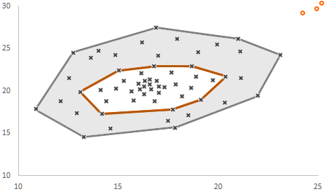
Tukey Bagplot is the two-dimensional generalization of a boxplot. Investigating the distributions of both variables with independent boxplots does not reveal anything about the simultaneous behavior of paired values. The dark gray area is called “the bag” (containing 50% of the points), the light gray area is called “the loop” (the other 50% of the points minus the outliers) and the outer polygon of the light gray area is called “the fence.” Without going into details, a Tukey Bagplot reveals similar metrics as a boxplot: location (the depth median, white cross), spread (bag size), correlation (bag orientation), skewness (the shape of the bag and the loop), and tails (the points near the boundary of the loop and the outliers in red). Even if the drawn polygons go through different points, they are just conventionally computed convex hulls, used to enclose sets of values. In this case, the lines have just a separator role.
This was by no means an exhaustive list, but it gives a good indication of the many roles lines can play in different forms of display. There are many other graphical forms that feature lines: regression lines, dendrograms, hierarchical trees, and the list goes on. Do you know of any other roles for lines in visual displays? What are your thoughts on this subject? Leave a comment!
Note from Cole: Dan, HUGE thanks for writing this post and teaching us all about the many different roles of lines in data visualization!