a tale about opportunity
One statement that I make often and emphasize repeatedly when teaching workshops is that when it comes to explanatory analysis, we should never simply show data; rather, we should make data a pivotal point in an overarching narrative or story. Today, I’ll take you through an example that illustrates this transition from showing data to using data to answer a question in a way that leads to new insight.
Let’s assume you work for the pharmaceutical company, Gleam. At Gleam, you focus on Product X (common abbreviation: PX), a medication for Aglebazoba (this is a real example, but I’ve anonymized it and had some fun with the names to preserve confidentiality—these names sound like a foreign language because that’s how pharmaceutical naming sounds to me!). You’ve been tasked with providing an update on Product X’s penetration in the marketplace.
After considering this for a bit and discussing with some colleagues, you decide there are two important things to consider. First, the disease doesn’t affect everyone equally. Rather, diagnoses tend to be classified by severity into Mild, Moderate, and Severe. So you decide that categorizing the data in this way will make sense. Second, when thinking about how to measure penetration, you decide that the population of those diagnosed with the disease is the most straightforward way to quantify the potential market currently. Given these considerations and the data you have on hand, you create the following visual.

This stacked bar graph looks pretty good. The design is clean, everything is titled and labeled. Severity increases as we move up the graph, which makes sense. N counts were included to tell me how many people each bar represents. Color has been used sparingly to focus the audience's attention, with words at the top to tell them why they should focus there. Let's consider the takeaway highlighted here: a greater proportion of Moderate patients are taking PX compared to the total diagnosed with Moderate severity Aglebazoba. That's interesting. But does it answer the question we set out to?
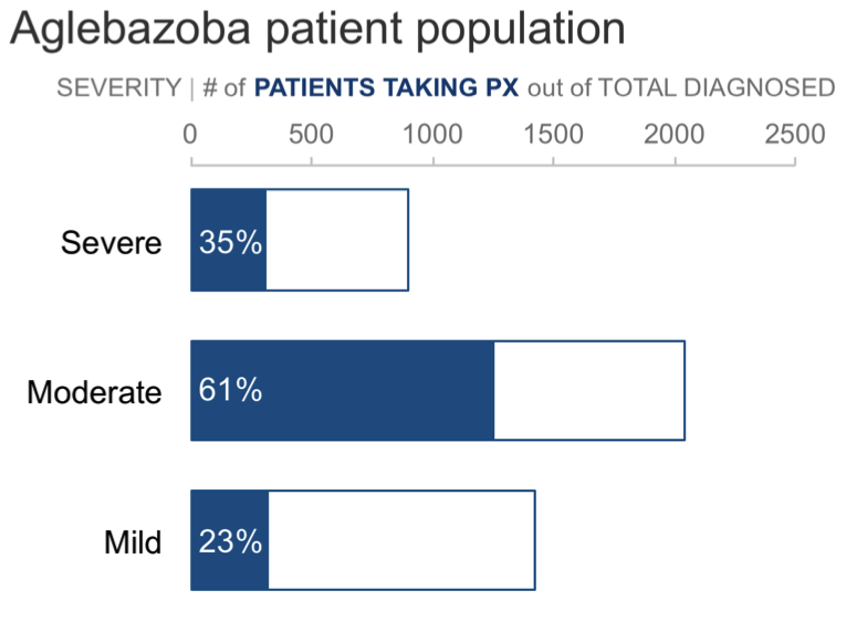
In the above, we're graphing the % of total across two categories: (1) total patients diagnosed and (2) total patients taking Product X. But what if rather than severity as a % of total, we make severity the primary category and within that look at those taking the drug out of total diagnosed? I'll do this in the following step, and will also switch from graphing percents to graphing the absolute numbers (we'll incorporate the percents back in momentarily).

In the above view, the overall length of the bars represents the total number of patients diagnosed with Aglebazoba. The blue portion represents those taking Product X. If percents are important, we could add labels on the blue bars. I'll do that in the next view. Note now that this isn't % of total taking Product X, but rather the % taking Product X out of the total diagnosed with the given level of severity.

So 35% of those diagnosed as Severe are taking PX, 61% of those with Moderate severity are taking PX, and 23% of those with Mild severity take the drug. Note that we can see the same thing here that was highlighted in the original graph: a higher proportion of those with Moderate severity are taking Product X compared to the other severity levels. But with this view, I can also see something new: opportunity. The blue portions of the bar represent those currently taking PX. Which means the grey portions of the bar represent those who aren't currently taking Product X... but potentially could be. Let's show this as empty space to be filled in:
Now I can see the opportunity. But let's emphasize that even more, via darker, thicker lines:

When I look at the above, the labels in the blue portion of the bars seem to be competing for attention with the opportunity in white. That's an easy fix: let's label the white portion instead.

I recognize I may be bothering some people when I graph absolute numbers and label with percents. If you fall within that camp, we could address by taking the percents out of the graph...

...but then tie the percents back in when we put all of the words around the visual to help make sure it makes sense to my audience and that they focus on the takeaway that I want them to. I see this as a tale about opportunity. Let's use words to make that point clear to my audience:

After you've created a graph in response to a question, consider that question again. Too often, I find that we stick with the first way we aggregate the data and first view of it that we land on. It's easy to provide data that is relevant to a question without actually answering the question. If we step back and think about what sort of tale we can use the data to tell—is it a success, a failure, a call to action, or, as we've seen here, a tale about opportunity—it may reveal new ways to aggregate or visualize the data that will help you help your audience understand something new.
If interested, you can download the Excel file with the above visuals.
10/31 update: A couple people have commented that the tendency is to want to tie the blue percents in the text to the blue portions of the bars in the final iteration above, which is confusing. This is a great point (that's the Gestalt Principle of similarity, by the way, that makes us want to connect similar elements, like things that are colored the same). I've made an update to outline the opportunity in black and use black for those percents instead, as a way to visually make a distinction between the blue (people taking PX) and black (opportunity: those who aren't but could be taking PX) and tying the black portion visually to the percents in text through similar use of color. See below for the updated version. I think this resolves that prior confusion—let me know what you think!
Related thought: this is a great example of why it can be useful to seek input from others on our visual designs. When we get familiar with our data, we know intuitively how we want others to look at it, but this isn't necessarily how they will. Soliciting a fresh perspective is a great way to see our data through someone else's eyes and learn from this how to potentially further improve or refine our approach. Thanks for the feedback!

Continue learning about different ways to visualize data with our chart guide and flex your data storytelling muscles with hands-on practice exercises in the SWD community.