more Americans are tying the knot
The Pew Research Center reports on some fascinating data. But I tend to be underwhelmed with the way they illustrate this data visually. The graphs aren't horrible. They look nice. They are well-labeled and on topic when it comes to the stories and reports in which they are found. But they still get under my skin. Because in many cases, some relatively minor modifications would transform the graphs from "not horrible" to great.
The following graph caught my eye as I was scrolling through my Twitter feed last week:

Take a moment to study this graph. What information does it reveal? What data points do you focus on? What comparisons does it enable you to make?
It's not a horrible graph. But it could be so much better. This prompted me to take a look at the full article in which this graph was contained. I had the same reaction to every visual display of data that was included. In all cases, the data in the graphs can help add visual evidence to the story that is being told (and Pew Research gets high marks from me when it comes to clearly articulating a story), but the graphs aren't structured in a way that facilitates that as well as they could.
By choosing the right type of graph and being more strategic with color, we can transform these graphs from not horrible to great. Let's take a look at each, in context of the stories that they are meant to help tell.
Story & Visual #1: Newly Married Adults
The new data show that 4.32 million adults (ages 18 or older) were newlywed in 2012, a 3% increase over the 4.21 million adults married in 2011.

Here's a quick overview of the changes I made:
- Shift from bars to a line graph: Yes, you can show time in a bar chart, but they don't tend to allow the audience to see trends as easily as the connected points in a line graph do. Also, years ordered descending downward isn't as intuitive as increasing years from left to right.
- Use color more strategically: Don't use color just to use color. Rather, use it to draw your audience's eye to where you want them to look. In this case, if the point we're making is about 2012, let's use color there (and only there) to help reinforce the story that we want to tell (in this case we could have possibly even made the last line segment between 2011 and 2012 that same shade of green, it's that slope that shows the 3% increase referenced in the article; we'll look at another example using this approach momentarily).
- Related thought - decimal places: I originally wanted to reduce the number of decimals to one, but that leaves points that don't appear to be the same labeled the same, which can be confusing (for example, the 2011 point in the line graph appears slightly lower than 2010, but if we reduce to a single decimal point, both data labels would be 4.2). If the values look different, make sure the data labels are set to a format that doesn't appear to contradict this.
- Related thought - axis range: The rule is that bar charts must have a zero-baseline because of the way our eyes compare the endpoints (I'm not positive that this was the case in the original). With line graphs, you can get away with the minimum value on your y-axis being something other than zero, but you have to be cautious about over-zooming and making relatively small changes appear more significant than they are. In fact, when I first plotted this data in Excel, the program automatically zoomed way in:
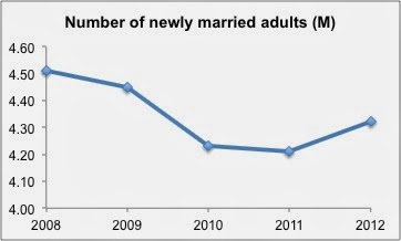
Don't let your graphing application pick your axis range!
Story & Visual #2: New Marriage by Education
Almost the entire increase in new marriages from 2011 to 2012 is accounted for by the college educated.

This is the graph that originally caught my eye in my Twitter feed. In this case, the comparison we want the reader to make is between the Bachelor's degree or more series and the other series over time. We want to draw special emphasis to the increase over time for this group from 2011 to 2012, to help make the point that this group accounted for nearly all of the overall increase in new marriages.
The original chart isn't constructed in a way that makes this easy. Again, I'd recommend a line graph. In this case, the data works well (lines aren't overlapping, creating a spaghetti graph) and it's easier to compare the relative heights of the lines when they are all oriented against the same yearly x-axis (rather than repeat the years for each category, as was done in the original graph). Since the main point is about the Bachelor's degree or more series, we can call the reader's attention there through use of color. We can emphasize the 2011 to 2012 increase by using a darker shade of the same color. I rounded the figures, as decimal places weren't needed here (and can actually result in a false sense of precision, since I believe these figures are based on a survey sample, so not the entire US population).
Story & Visual #3: New Marriage by Age
The prime age for getting hitched is 25 to 34.

A similar approach can be taken for the third visual in the article, which was designed the same as the second visual, but focused on marriage rate by age. Typically, I would suggest leveraging the natural ordering of the categories (keeping the age groups in order from lowest to highest, as was done in the original), however in this case I think we can break that guideline and still have a chart that's easy to read because of the clear labeling of the various series. Again, this design (line chart, aligned by common x-axis, using color to highlight the series of interest) allows the reader to make the comparison we want - between 25-34 year olds and other ages - more easily than the original. Again, I rounded the figures shown in the data labels.
Note in this case, given the story (the prime age for getting hitched is 25-34 years), we could have potentially reduced the data shown to just the 2012 figures (perhaps in this case using a horizontal bar chart to compare across the various age groups - with that approach, I'd suggest keeping the age groups in numerical order). There are some benefits to retaining the historical context, however. First, it helps to put the 2012 figures into perspective. We also leverage the fact that our audience is familiar with this chart design (and how to read it), since we used the same approach previously. Whether to limit the data to only the pieces that directly support the story or showing additional context is always a question to debate when determining what to show (and the answer will change depending on the situation).
Story & Visual #4: Staying Married
It is one thing to get married, it is another thing to stay married. In spite of the recent uptick in newlyweds since 2011, it is still the case that fewer adults were currently married in 2012 (50.5%) than in 2011 (50.8%). The share of adults presently married peaked around 72% in 1960.

It's probably no surprise that I stuck with the pattern of transforming a bar chart into a line chart here. My biggest issue with the original visual in this case isn't the chart type (though from a clutter/cognitive load standpoint, the single line is much cleaner than the multiple bars), but rather the discrepancy in time over the x-axis. In the bar graph, we start off in decades - 1920, 1930, and so on. Until the year 2000. After that, we jump to 2006. And then the figures are reported annually from 2006 through 2012. But all the bars appear visually the same, width- and spacing-wise. This is a big no-no.
In the remake on the right, I've plotted the decade figures through 2010 and connected them with a line graph. Then I separately (on another graph that's layered over the first - this is a true example of brute-force-Excel) plotted only the actual dates for which there were values (on a scale that started off 1920, 1921, 1922, etc.), including the annual data points leading up to 2012. I colored only the points of interest - leading up to and 2012 to reinforce that the percentage currently married is at an all-time low, and the peak that happened way back in 1960.
The meta-point here is: if there is a specific story you want to tell, don't simply show relevant data, but rather display it in a way that makes it clear to your audience where to look for the evidence of the story you're telling. Choose a graph type that enables your audience to easily make the comparisons you want them to. Use color strategically to draw their eye to where you want them to focus their attention.
For those who are interested, the Excel file containing the above makeovers can be downloaded here.