how would you visualize this data?
I had a follow up session yesterday with a group that recently went through one of my custom workshops. It was really great to see and hear how participants have been able to put what we learned to use and to discuss where they are facing challenges and strategies to overcome them. One participant recapped what they took away from the session: enhance what's important, tone down what isn't, and question the question!
We also looked at some specific data they were having challenges visualizing and had some fun experimenting with possible solutions on the whiteboard. There was one that we didn't get to that I want to share here for input:
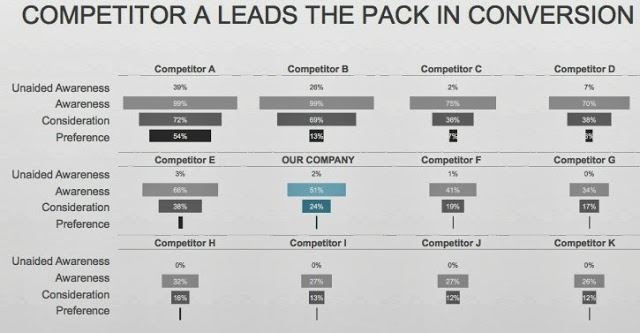
Click here to download the data in Excel. A few comments on the data:
- In the original, "Competitor A," "Competitor B," etc. were actual competitor names, which I've generalized here (and in the downloadable data) to preserve confidentiality.
- Unaided Awareness, Awareness, Consideration, and Preference are in regards to the given company's brand. This is sometimes known as the "purchase funnel". The data is collected through a survey; percents represent the percent of the total sample population.
- Unaided Awareness is the % of people who know the brand off the top of their heads (for example, What brands come to mind when you think of shampoo?).
- Awareness is in response to a list of brands: Which of the following brands of shampoo are you aware of?
- Consideration is which brand a consumer would consider purchasing.
- Preference is which brand a consumer is most likely to purchase.
- Conversion (highlighted in title) is the percent of people who move from one funnel step to the next (what percent of aware people consider you, etc.)
The intent is to be able to compare the brand of "OUR COMPANY" along these dimensions to the various competitors, as well as get a sense of where our opportunity lies.
I think this could be done more effectively than it is here. I have a couple ideas, but am lacking time at the moment to try them out. So I thought I'd solicit your help. How would you tackle this visualization challenge? Leave a comment with your thoughts!