
the waterfall chart
A few weeks ago, Andy Kriebel did a makeover of one of my visual makeovers. His version was a waterfall chart. I like waterfall charts, so I thought it might be useful to do a post focusing on them: what they are, an example use case, and how to use what I like to consider "brute-force-excel" to create them.
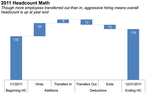
I find waterfall charts to be useful when you are interested in visualizing a starting quantity, positive and negative changes to that quantity, and the resulting ending quantity. For example, in my day job it's sometimes useful to visualize changes in the number of employees in a given team over a period of time, say, over the course of a year. The starting quantity is the beginning of period (e.g. beginning of year) headcount. In terms of changes, there are some things that increase headcount (new hires, transfers into the given group) and some things that decrease headcount (exits from the company, transfers to other groups). When all of these changes are applied, we are left with the ending (end of year) headcount. The waterfall chart that portrays this, then, could look something like this (note that all numbers are made up):
Some graphing applications (like Tableau, which Andy used) have built-in waterfall chart functionality. However if you're working in Excel, like me, that's not the case. Fret not, as all it takes is a little brute force to turn a bar chart into a waterfall chart. The secret? An invisible series and a little bit of math.
Let me show you an interim step between where I started in Excel and the final product:
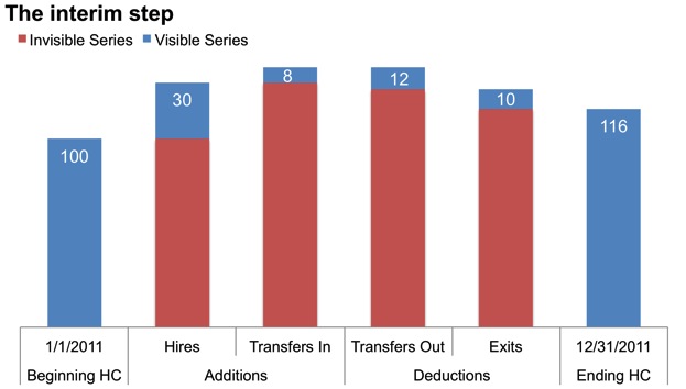
I have a stacked bar chart with two series: the visible series is the data that I want to show: beginning headcount, hires, transfers in, transfers out, exits, and ending headcount. The invisible series acts like a sort of placeholder to help me line up my other data. Each addition begins at the uppermost point of the column that preceded it and builds upward. At the turning point from addition to deduction, the first deduction starts at the top of the prior bar and shows its value downward. Further deductions begin at the lowermost point of the column preceding it and pull the values further downward. Note that both the beginning and ending figures are anchored at the baseline, while the interim values float, showing the changes in total, piece by piece.
To get from this interim step to the final waterfall chart, simply right click on the invisible data series and reformat it so that there is no fill and no line. The horizontal lines connecting the bars require a little more brute force: those are lines I've drawn in Excel on my chart.
You can download the Excel file here in case you want to take a closer look (and see the math I used for the invisible columns).
A couple of notes on my personal preferences when it comes to waterfall charts:
Horizontal lines connecting the bars: I like how these draw the reader's eye across the graph from left to right and also think the lines help to make it clear that the starting point for the next change is where the last bar ended. I do recommend keeping the lines thin and light so they don't compete with the data visually.
Using multiple colors: I often see waterfall charts with the beginning and ending bars one color, the increases another color, and decreases a third color. I think that if the chart is labeled well and the bars have sufficient space between them, this additional segmentation mechanism is unnecessary. This comes down to personal preference as well as what you want to convey to the audience. If the distinction between the positive and negative changes is really important, you can call more attention to them by varying the color. As always, just make sure your use of color is an explicit decision (not chance or graphing application defaults) and draws your audience's attention to where you want it.
There are a couple of additional considerations to keep in mind when using waterfall charts:
Because the bars do not have a consistent baseline, our eyes don't do a great job of accurately comparing segments that are close in size, so I recommend labeling the values explicitly to aid in interpretation. Note that if there is an apparent difference in size and the specifics aren't important, you can omit these data labels (but then you should add a y-axis so the reader can interpret the data).
If there isn't an intrinsic order in the categories, order the increases and decreases (separately) by size (smallest to largest or largest to smallest).
What's your view on the waterfall chart? Can you think of other applications? Leave a comment with your thoughts!