
how to do it in Excel
One common piece of feedback I get after presenting on the topic of data visualization goes something like this: Wow, that was super useful. I'm never going to use pie charts again. But when it comes to the graphs, how do you actually make them look like that? I'm not Excel-savvy...help!
Pretty much everything I do is in Excel. I like to refer to it as "brute-force" Excel, because in many cases the graphing application doesn't make it so straightforward to get from plotting the data to the final product. So I thought I'd take a few minutes to walk step by step through an example to expose those who question their Excel expertise to some of my tricks.
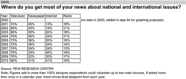
The following example may look familiar; it's from the FlowingData Challenge earlier this year (original blog post here). The full Excel file can be downloaded here.
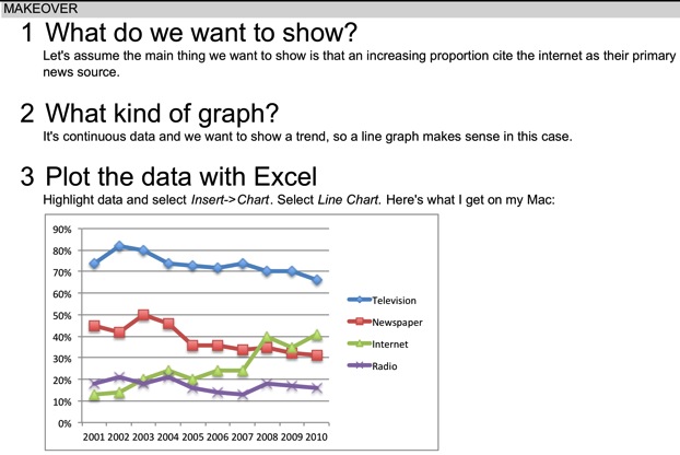


What you require most to get from Excel's original graph to the one you actually are proud to present is patience and time. You'll improve your odds of success by leaving ample time for the visualization step: don't rush this important piece, as it's what your audience sees of all your hard work!